
Design Review: Estates Drive

Early October of 2018, we walked a house on Estates Drive in Park City with a couple from Houston. They were looking to transform a 4 bedroom 4 bath built in the early 90’s into a mountain modern ski home fit for their growing family. As we toured the space, we took it in. The overly stark walls, dated river rock fireplace, and carpeted bathrooms with wallpaper in one that looked like it was from a Dr. Seuss/Wallpaper Warehouse collaboration – this house clearly needed a design makeover! But it had great views of the mountains and golf course, nice sized bedrooms, high ceilings, and was in a sought-after neighborhood. We were in!
Nine months later, with new tile, countertops, plumbing, lighting and paint, and stain, you would have never known this was the same house! Scroll on to see the transformations…
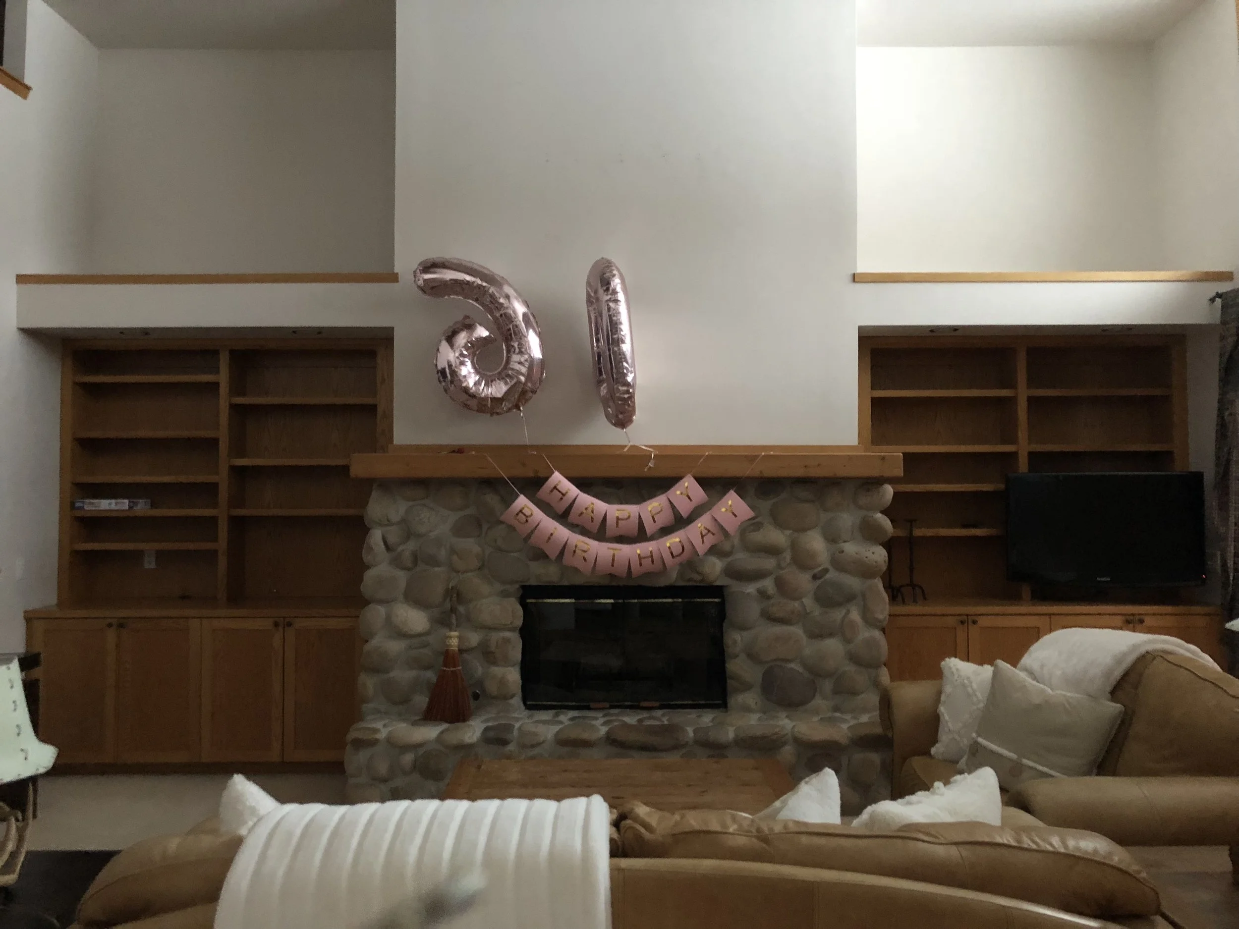
AREA 1) THE LIVING ROOM
This blonde wood and dated fireplace stone were a no-go. We painted the cabinetry, installed new hardwood flooring, new fireplace box, and replaced the river rock and wood mantel with a more contemporary, flat stone. We also removed the hearth to allow for more space in the living room so we could bring in a large sectional and updated coffee table. The result: a living room where the family would actually want to congregate après ski. (After image above).
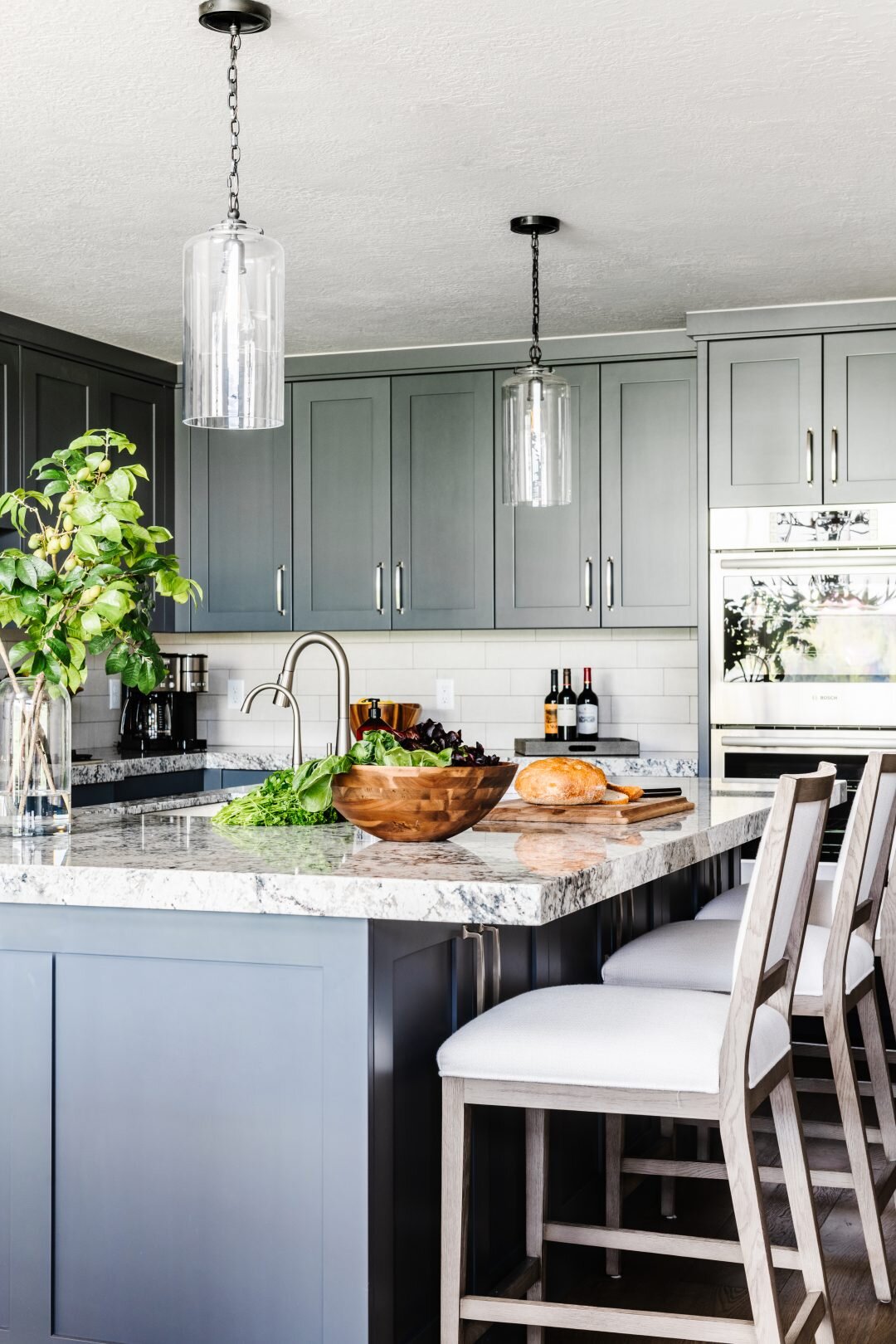
AREA 2) THE KITCHEN
We decided, rather than work with a less-than-ideal lay out that also didn’t allow for decorative lighting, to start from scratch. We installed new painted cabinets for a little more interest, added more contemporary grey counter tops, a punchier backsplash and new stainless steel appliances. With a standard rectangular island, we could now add glass pendants above to make the ceilings feel taller and add more soft lighting at night. Updated plumbing fixtures and hardware made this new kitchen complete. When our clients walked in for the first time, they were overjoyed.

AREA 3) THE POWDER ROOM
Apart from the distracting wallpaper, for an entertaining bathroom, this space felt cramped. We pushed back the shower wall so it was flush with the rest of the space, installed a new custom vanity that resembled more of a furniture piece, and then completely redid the tile, plumbing, and lighting. With a metallic grasscloth wallpaper and a European-style glass shower door, this bathroom’s design face-lift was complete. The result: a Powder Bath glamorous enough for guests.
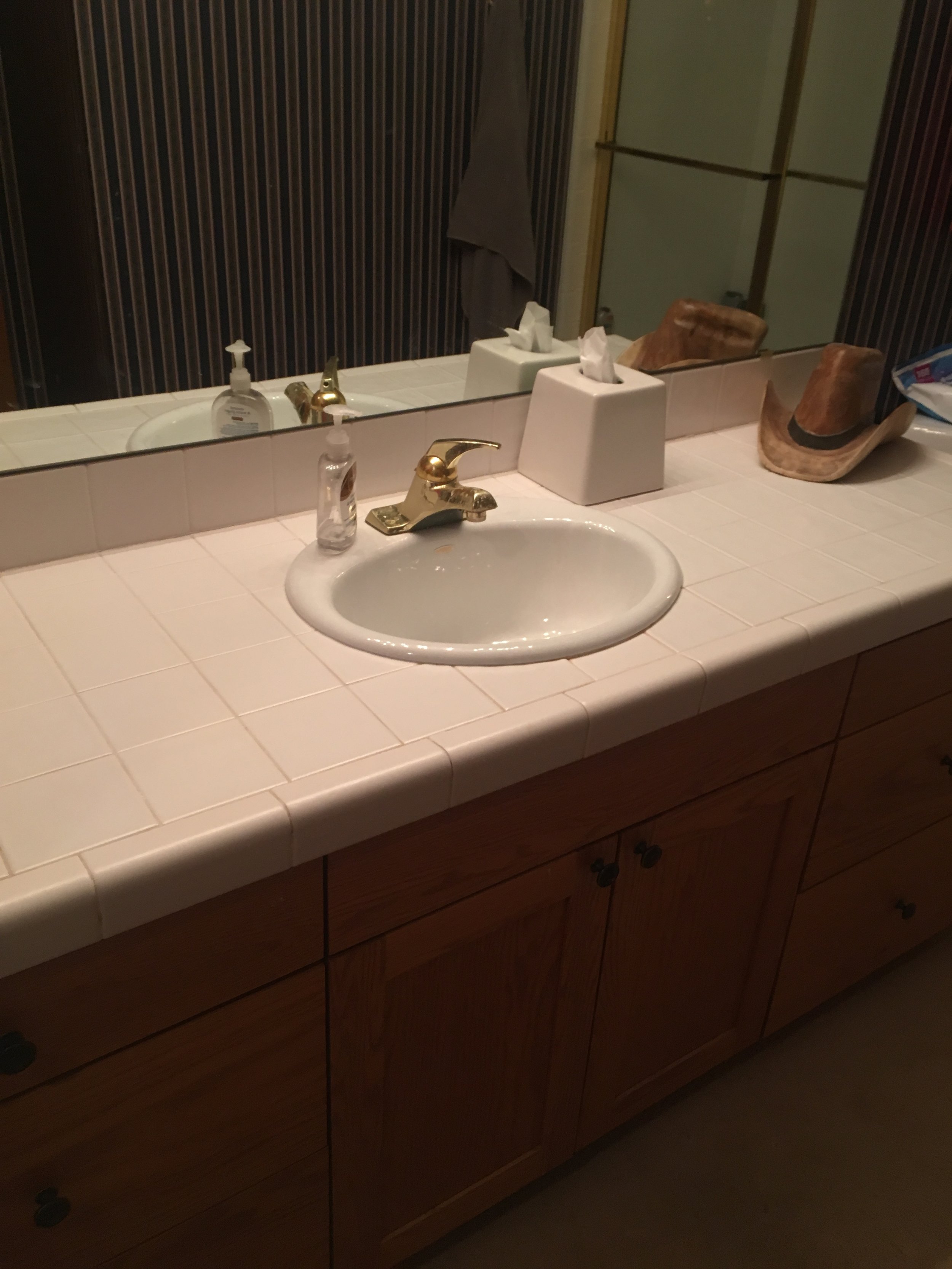

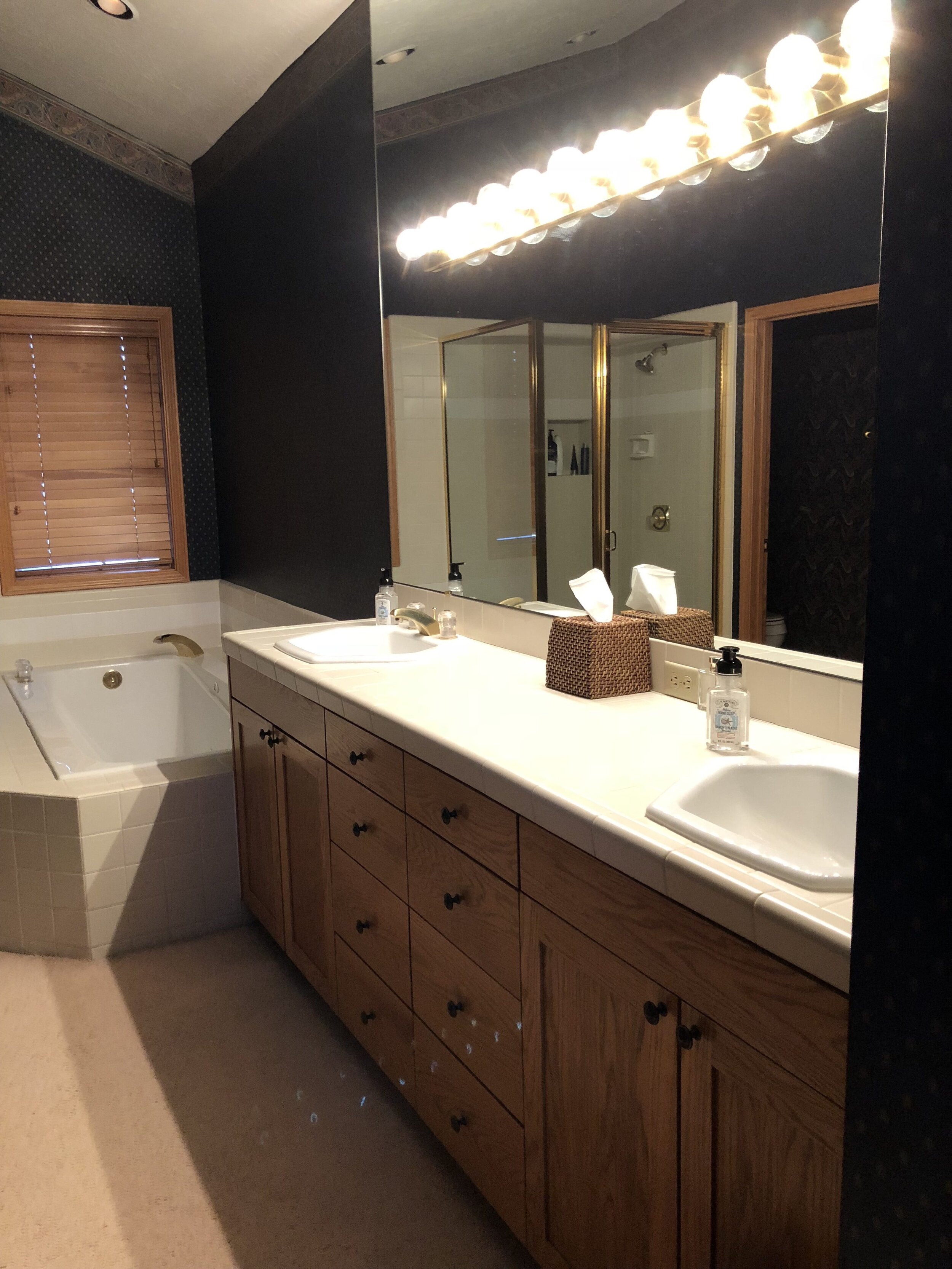
AREA 4) MASTER BATH
For our client’s potential resale value, this Master Bath wasn’t cutting it. The dark wallpaper made the room less than appealing while the globe vanity lights didn’t create the proper lighting or sophistication. We tore down the paper, replaced the carpet with woodgrain porcelain tile, removed the built-in tub and substituted it with a more chic freestanding piece, and completely redid the shower and vanity. Installing three sconces with two individual mirrors added a touch of elegance above a beautiful marble countertop. A little soft taupe paint and a darker stain for the doors and windows completed the look. The result: a bathroom truly fitting for a Master suite.

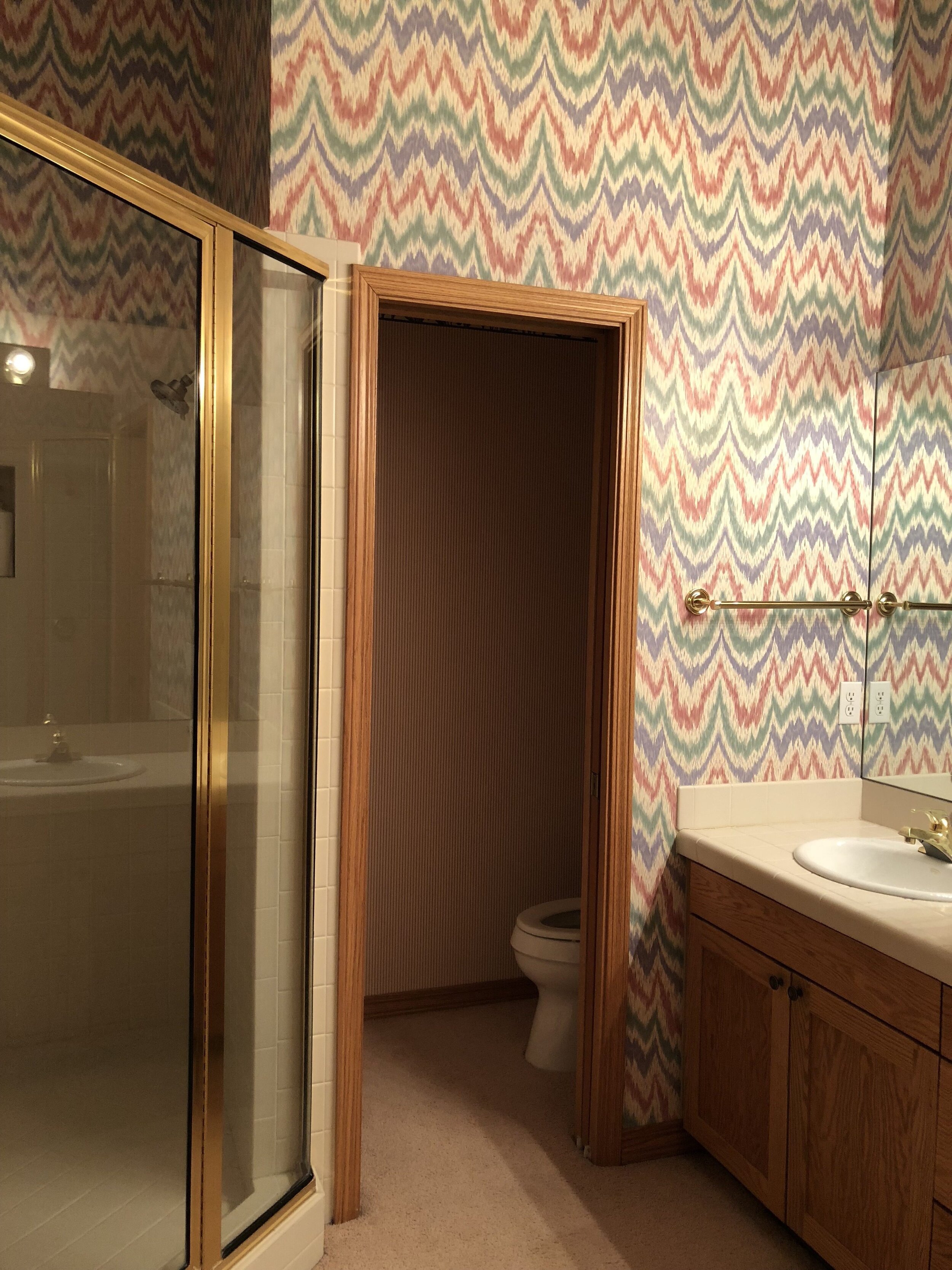
AREA 5) THE UPPER GUEST BATHROOMS
Similar to the other bathrooms, these upstairs spaces really needed a fix, especially with this zig-zag wallpaper – gah! We redid the showers, kept the vanities but stained them dark, installed new countertops, changed the lighting and it was like the other bathrooms never existed. The result: soft and serene guest baths perfect for the family.


Want to give your own house a makeover? Contact us for a quote! We’d love to talk to you about it.